Let’s face it—it’s too expensive to tear down walls and have an extension built so we could make our kitchens larger. Yes, that’s the reality we have to deal with, small kitchen spaces, cramped work triangle and tiny spaces for kitchen appliances.
We sure have grown envious of those contemporary houses with large kitchens spread out in magazines or pinned Pinterest posts. So we often plan our remodel project, which often leaves us spending way too much just to achieve the kitchen of our dreams. Who wouldn’t want that anyway?
But there’s always another way to approach this. Do the next best thing—strategically make your small kitchen appear larger and more open with these foolproof suggestions.
Natural lighting is the best, always!

Don’t block the light from pouring into your kitchen as natural light helps enlarge the space and make it feel more open.
If there are only a few windows and there’s only limited natural light, use a high gloss kitchen finish on the cabinet doors and add glass-framed pictures or mirrors so light can bounce around the space.
You can always play with artificial lighting such as daylight bulbs to add more light to the room. Remember to keep window treatments to a bare minimum, although if privacy is your concern, opt for opaque shades, which still allow the light to go through.
The colour palette
You might want to reconsider bold, bright colours for your small space. Keep everything—from the flooring, wall paint and even cabinet finishes—in the same tone.
Why?
Ideally, what works best for large kitchens doesn’t necessarily looks good for small ones, in this case bright, bold contrasting colours. Subtle differences in tone, meaning colours are the in the colour family with only slight variations, work best in small kitchens, making the most of the space.
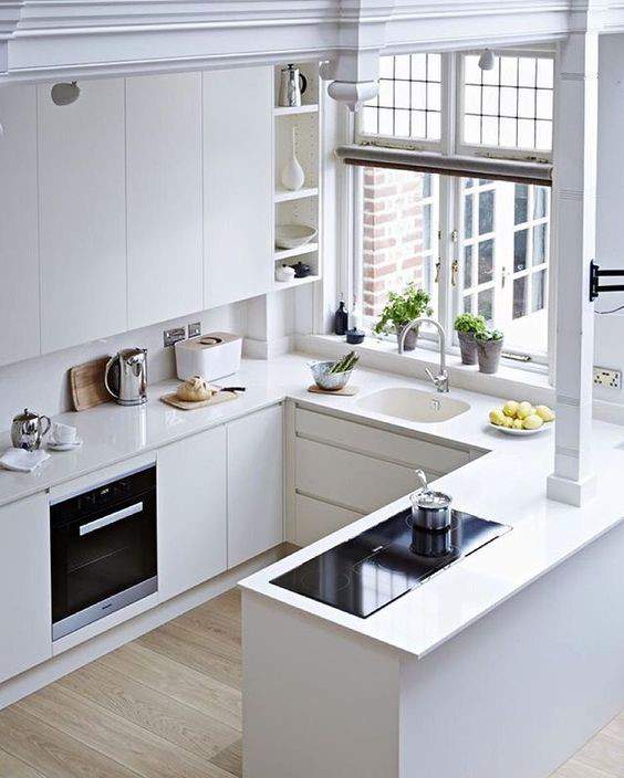
In the kitchen below, notice how the cabinets blend well with the wall paint. Although the space is relatively limited, it surely does feel spacious.
White is your best friend
If you’re not feeling brave enough, you can always stick to white. The lighter the colour, the brighter the room will feel, and the more spacious it will visually appear. In this case, white is the most practical approach.
White, especially a white high gloss kitchen finish, reflects light and enhances the sense of space. This will make the kitchen walls recede.
Play with different shades of white and include contrasting textures to create depth of perception to the space and keep the space from looking a bit too sterile.
The finish
As already mentioned above, a glossy surface reflects light around the room. However, if gloss is a bit too much, you can always opt for a semi-gloss or a satin finish. Both still have the same reflective nature of gloss, minus the flashy appearance.
Stainless steel appliances are also now offered in glossy finish. Just be careful not to overdo the gloss in your kitchen.
Flooring and elongated patterns
Most often, homeowners forget to include the flooring in the kitchen design. Flooring, in fact, is one of the most important elements in functional design.
Draw the eye vertically or lengthwise with striped floors or geometric patterns to make the room appear taller or longer than it actually is. However, if you can’t change your kitchen floors, opt for a patterned runner to achieve the same elongated effect.
Cabinetry
There are 3 ways you can approach cabinetry to open up your space:
1. Open shelving
2. Glass doors
3. High gloss finish
Open shelving and glass doors. Instead of going for the traditional approach, remove cabinet doors completely or replace them with glass. Either way, you’ll end up having an airy feel to your kitchen, instead of the bulky traditional cabinetry with its full decorated doors.
However, you can only get away with open shelving or glass doors if—and only if—you can maintain a tidy kitchen.
Storage

The secret to a larger-looking space is storage. Displayed clutter will make the room feel more crowded.
Kitchen storage is more than just keeping things tucked away. It’s about keeping things clean and tidy, keeping decorative details to a minimum and maintaining clean lines.
Create a dedicated space for each kitchen item and appliance. Follow the different kitchen zones and maintain a functional kitchen triangle. This way, you’ll be able to maximize your functional kitchen space minus the clutter.
Appliances
Do you really need that double dishwasher? How about a family-sized fridge?
When you have a small kitchen, think about the sizes of your appliances as well. Smaller-sized appliances will give a sleek, elegant sense of style to the space, without overcrowding it.
Light décor and furnishings

Of course, what’s a beautifully designed kitchen without some touch of décor and furnishings?
Certain design elements leave open sight lines such as slim chairs, narrow tables and petite kitchen islands. What you want to avoid are chunky furniture that add to visual clutter and bulk and make the space feel cramped.
The only way is up
Opt for visual elements and patterns that guide the gaze upward, or toward the ceiling. Vertical lines on the wall lend the impression of height.
This is also useful when it comes to storage. Since there is limited space for kitchen cabinetry, why not an open shelving going up? You can display your mint-condition china while not having to worry about visual clutter.
The takeaway
Never underestimate the power of clever design and a little addition of visual tricks to make your kitchen look larger. From open shelving to proper lighting to the use of high gloss kitchens finish, you can indeed make that dream kitchen a reality.